Fitness People
This conceptual project came to life inspired by personal experiences of using a local gym's app. It is common for many to use their gym's of choice app on a weekly or daily basis, not just to check in to the facilities, find out information, customer support or carry out bookings but also to feel part of a community.
After an almost daily use of my gym's app I noticed that it lacked some key aspects that other gym apps did have and that in overall the UX had several flaws and weaknesses that generated the risk of translating the experience of using the app into a nuisance.
As a Product Designer with some spare time at that particular moment I decided to dedicate a bit of time to come up with a solution for this, as well as having some fun along the way.
The first steps on tackling a project of this nature would involve a heavy research phase in order to gain enough quantitative and qualitative data to generate the big picture and shed light on the most common issues that a regular user could face when choosing a gym franchise to sign up to and on a later stage issues that could develop during usage and loyalty phases.
Some field surveys and interviews were done to gain first hand feedback about the most common issues that users encounter. Thanks to this a customer journey map and user personas could be drawn and analysed in order to understand better the user's mindset and as outcome re-draw user flows.
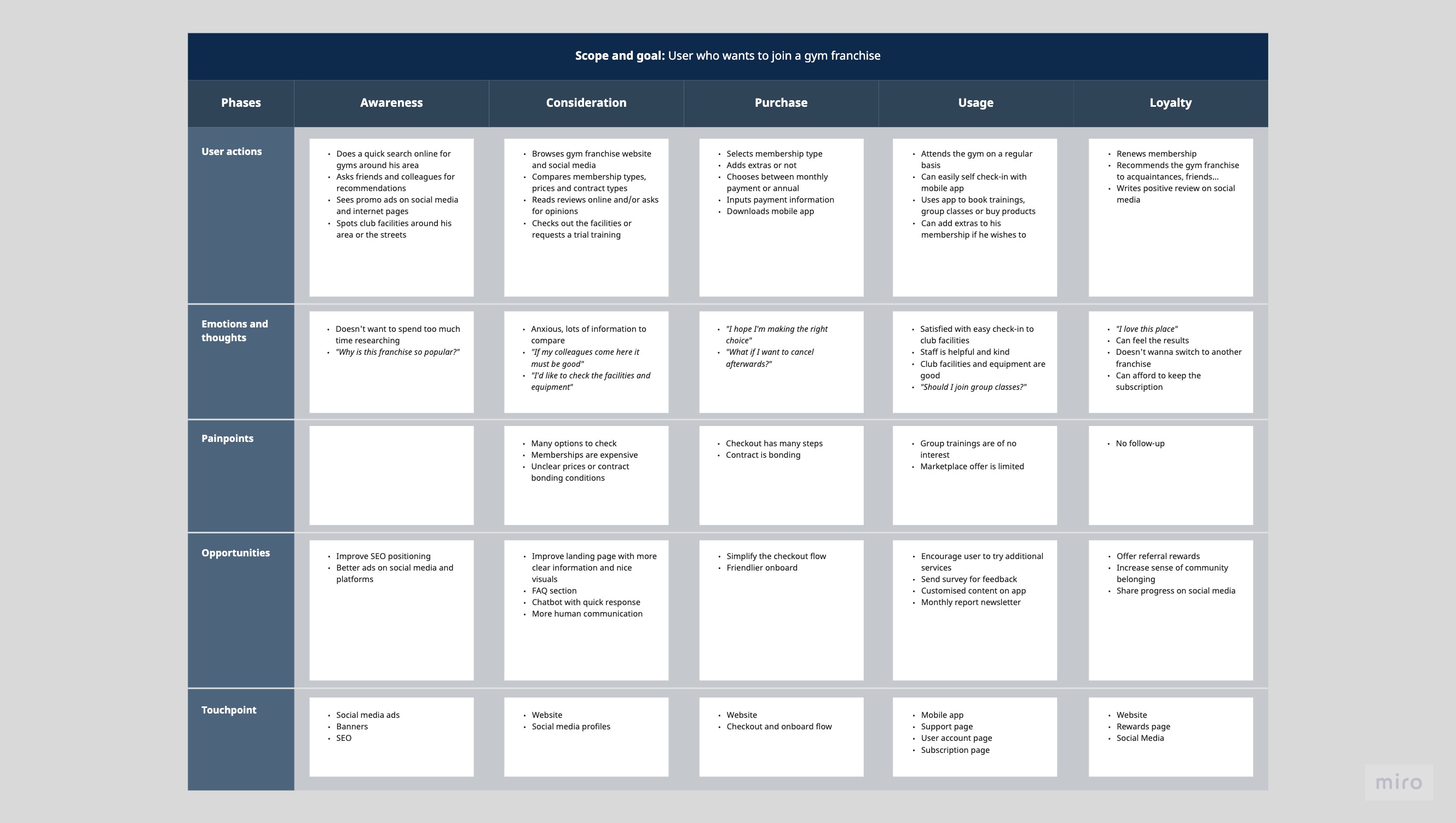
After observing the results from these research methods several observations could be pointed out regarding the flaws of the product's lifecycle, acquisition and usage stages. Not just the navigation was rather improvable but some key features of the app were lacking prominence due to these flaws that were generating that users wouldn't interact with them.
Considering all these insights a new approach for the app could be started in which these issues could be resolved and give the user a sense not of just accomplishment but also rewarding.
Competitor analysis also shed some light into how the app was missing out the current trends not just on a UX perspective in regards to features and easiness of use, but also from the visual and aesthetics side, as the current design seemed old-fashioned and it contributed the whole rather improvable experience of the app.
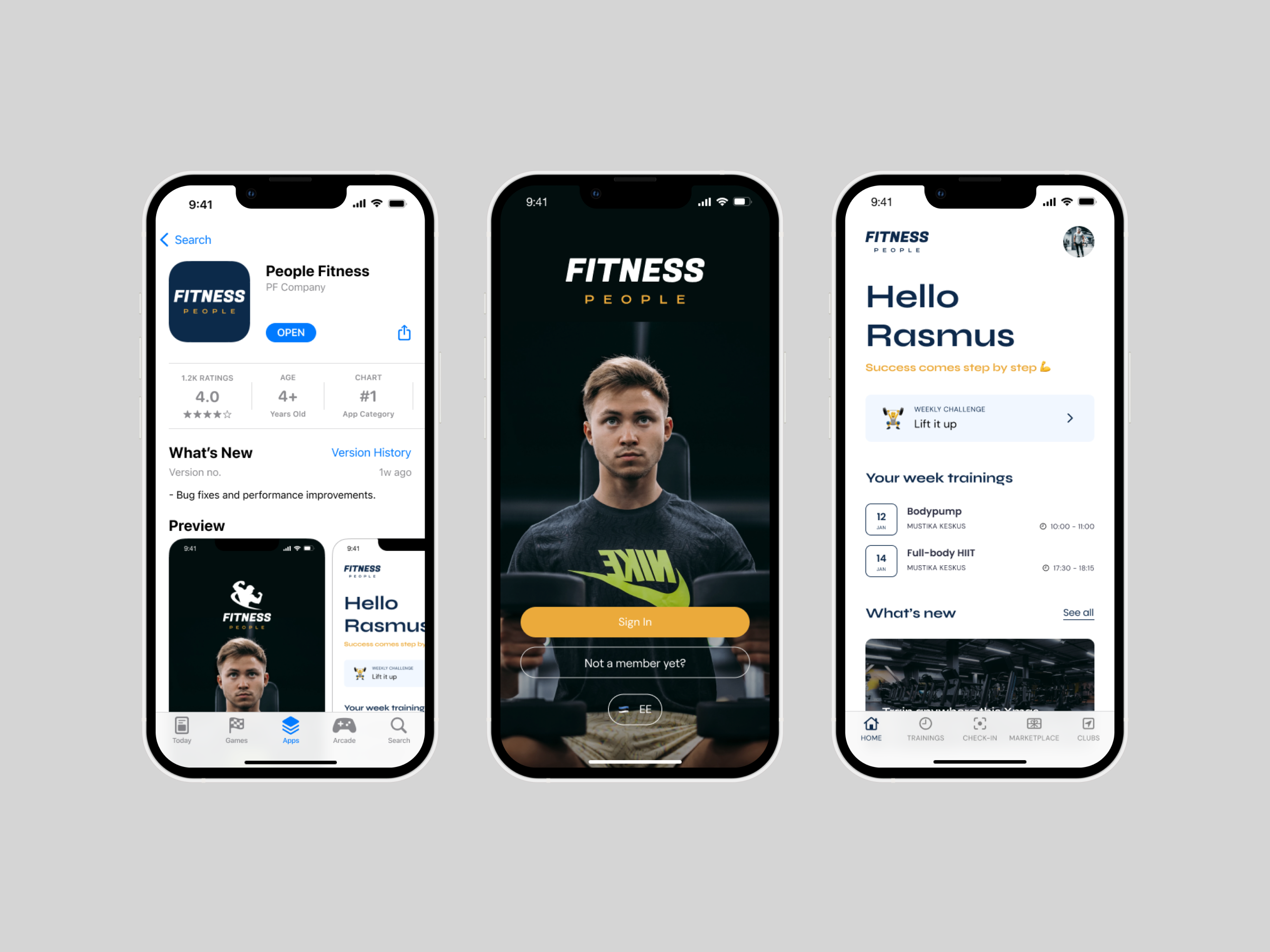
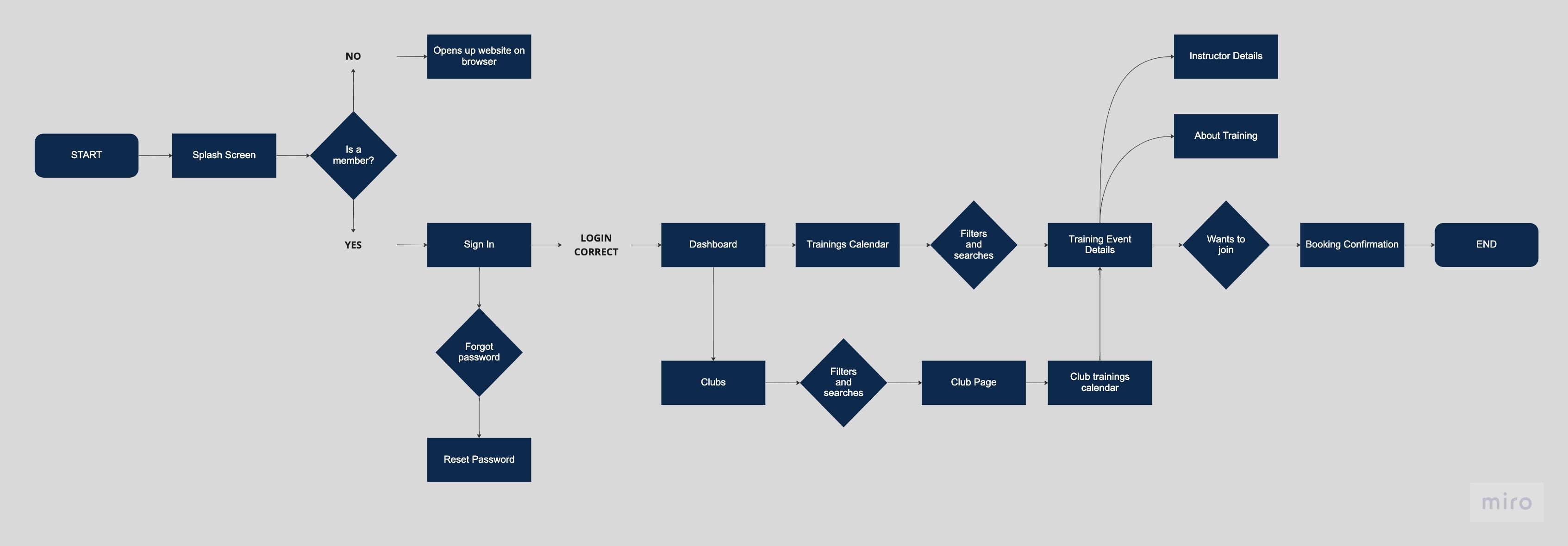
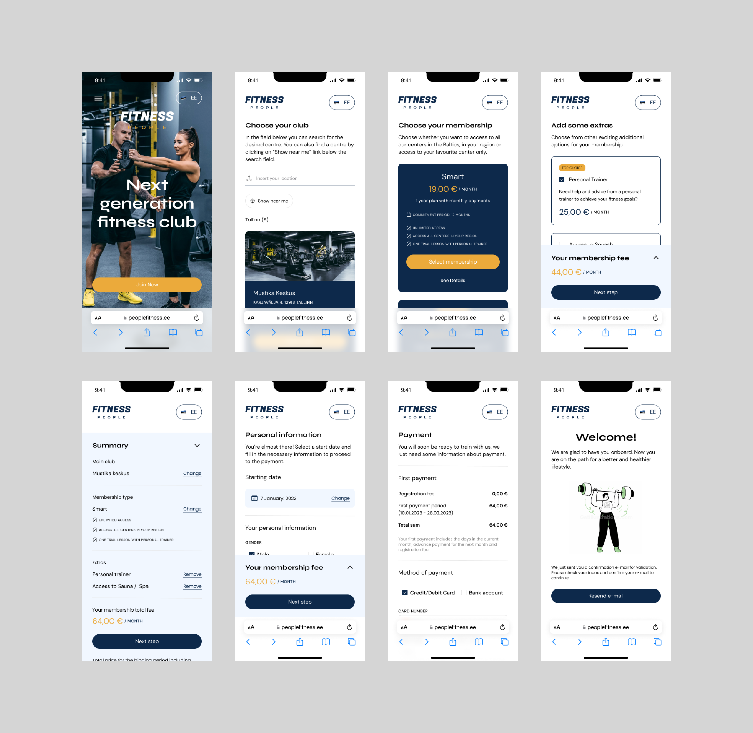
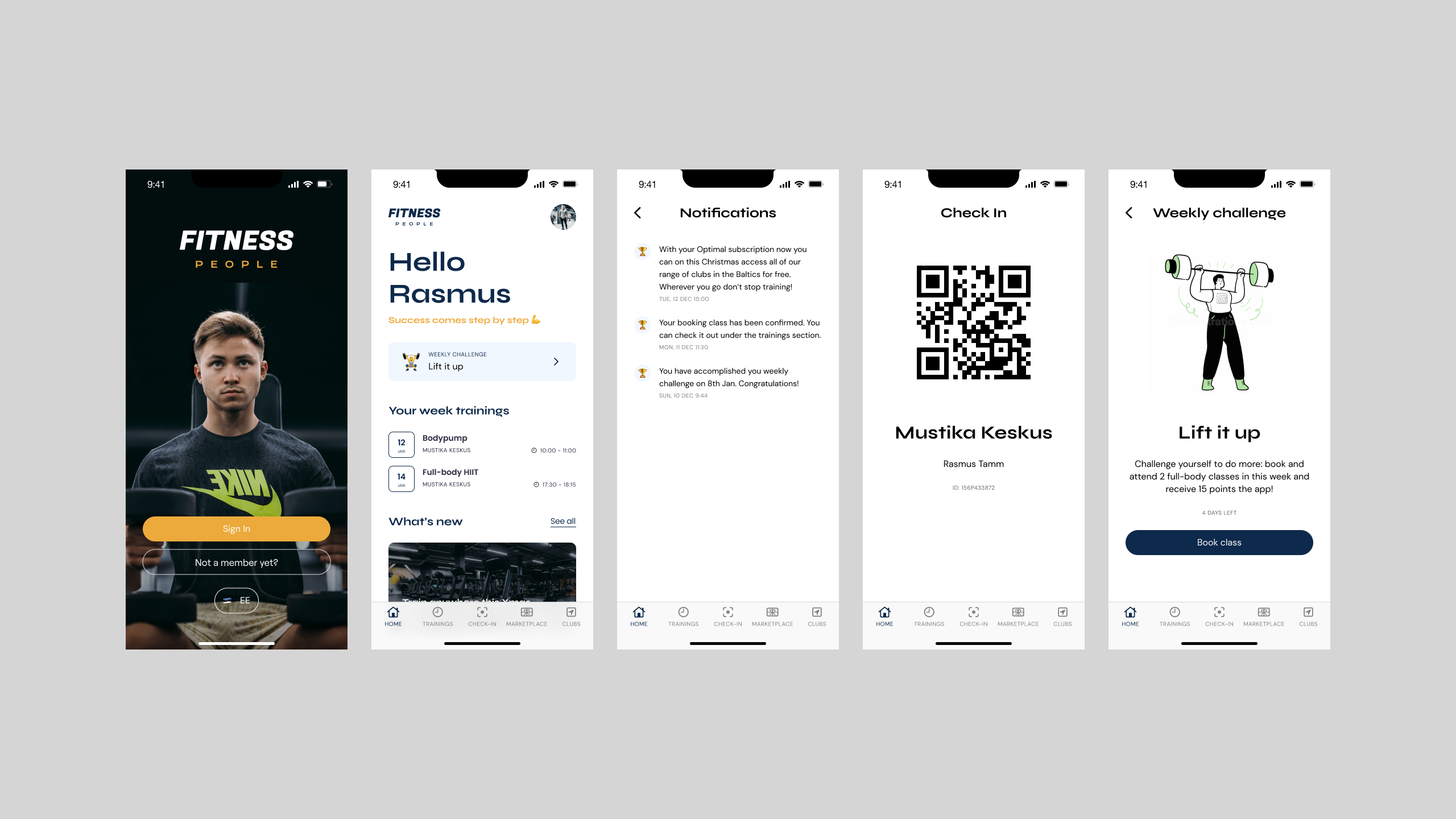
The onboarding and signing up flow that was implemented was too long and generated distraction from the main goal of the user. So that core functionality was also revamped in order to offer the user a simple, straight to the point and informative signing up process. In a matter of few minutes the user can complete the signing up steps on the gym's website and activate his account.

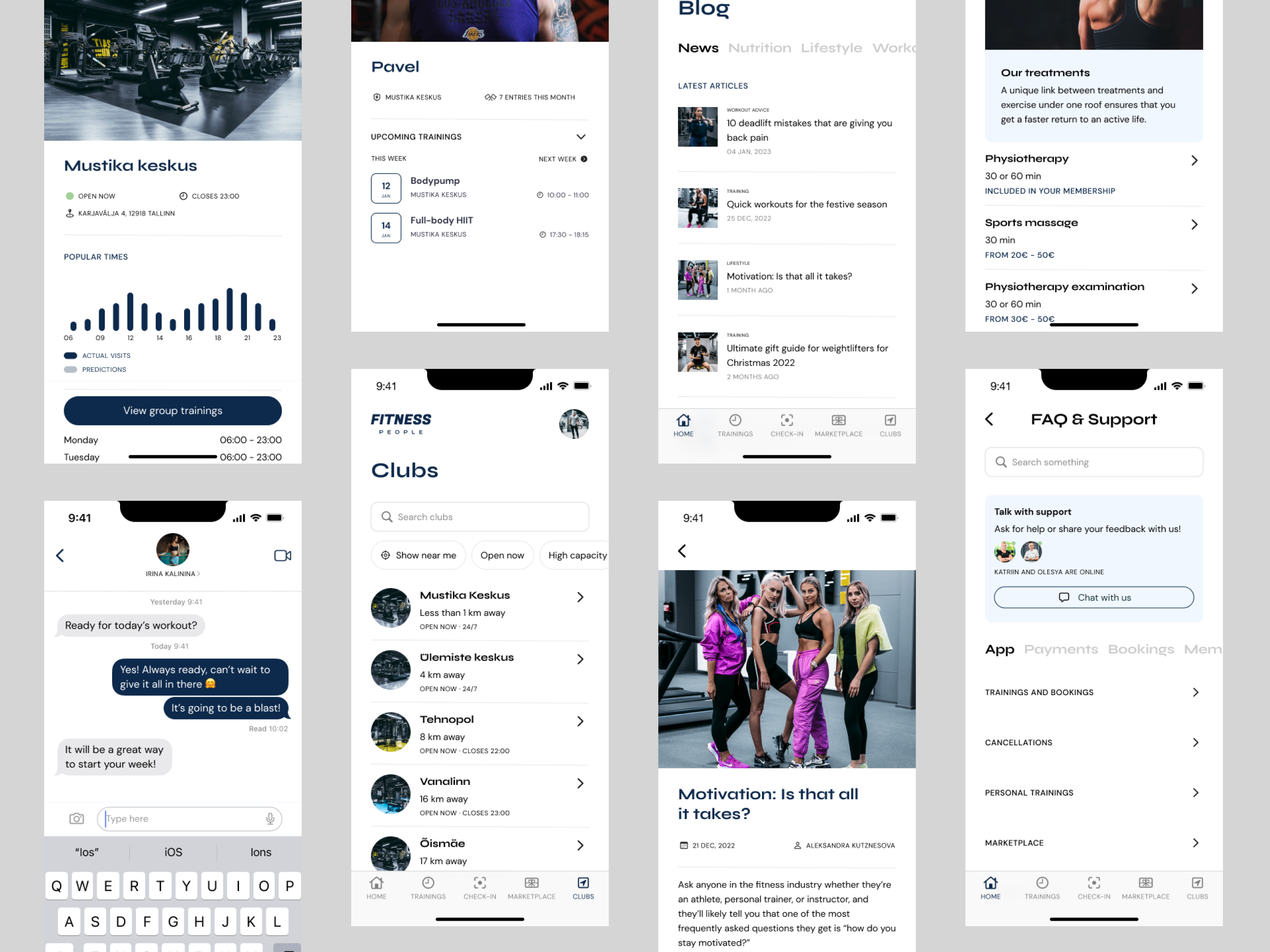
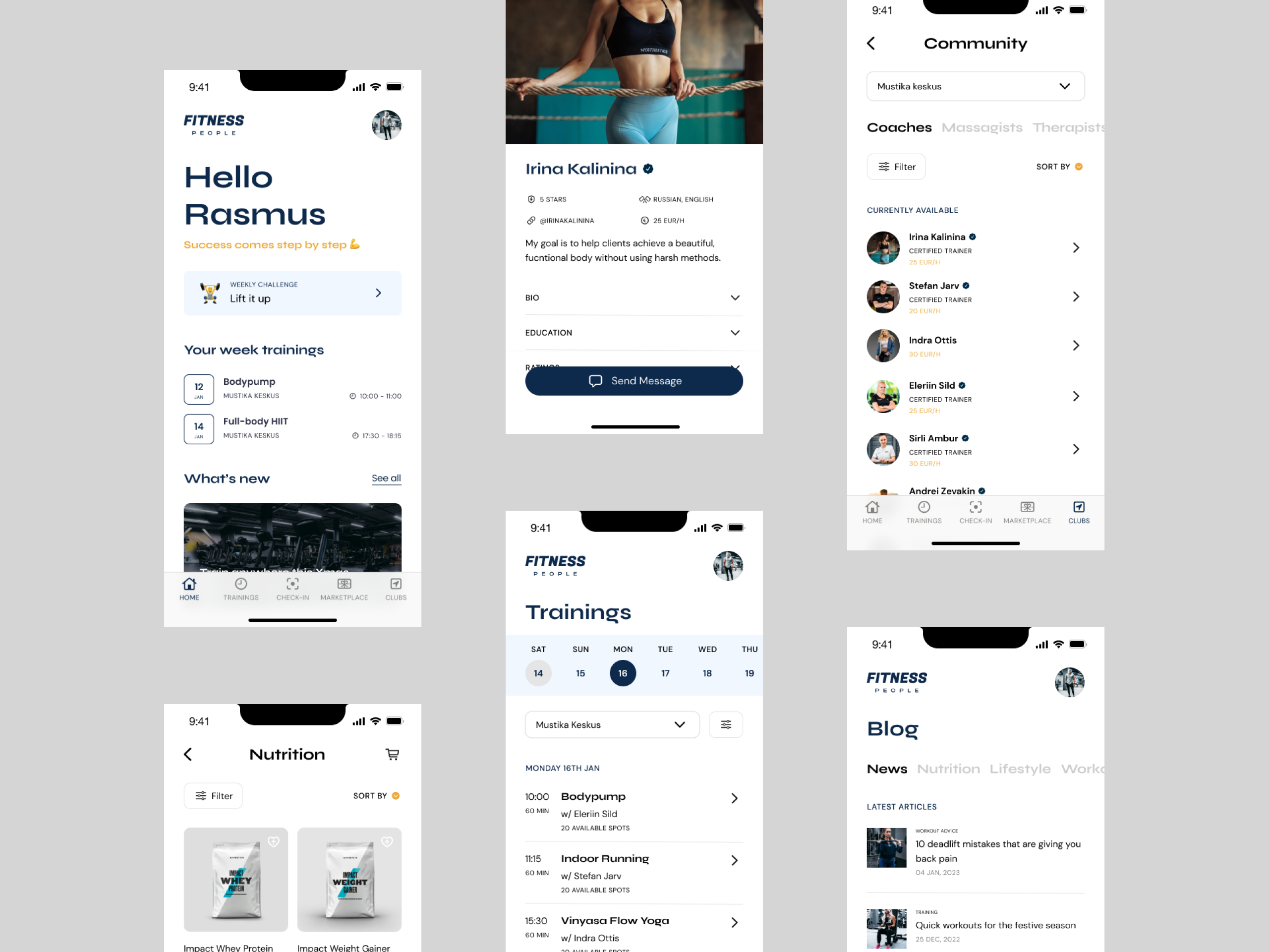
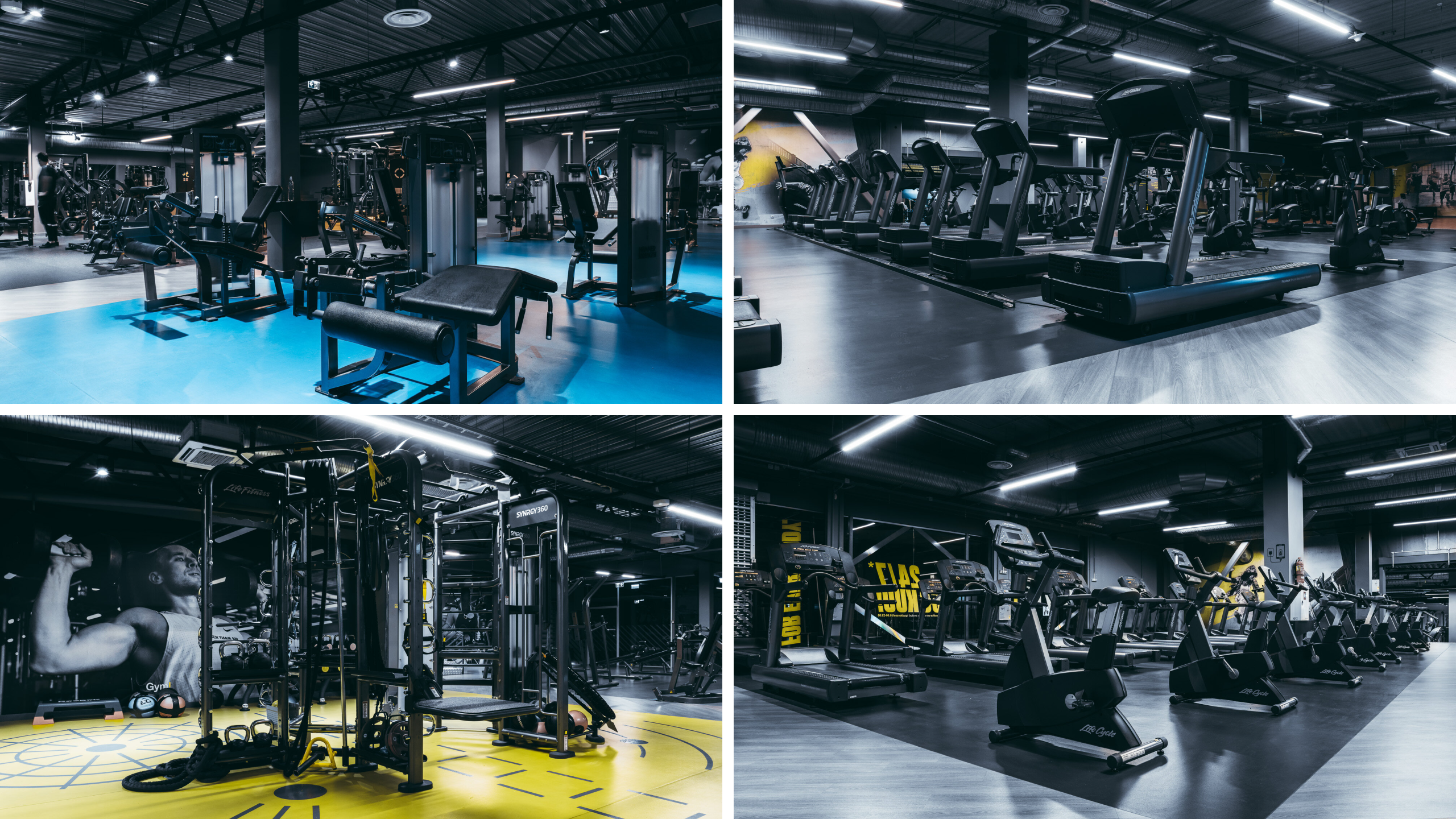
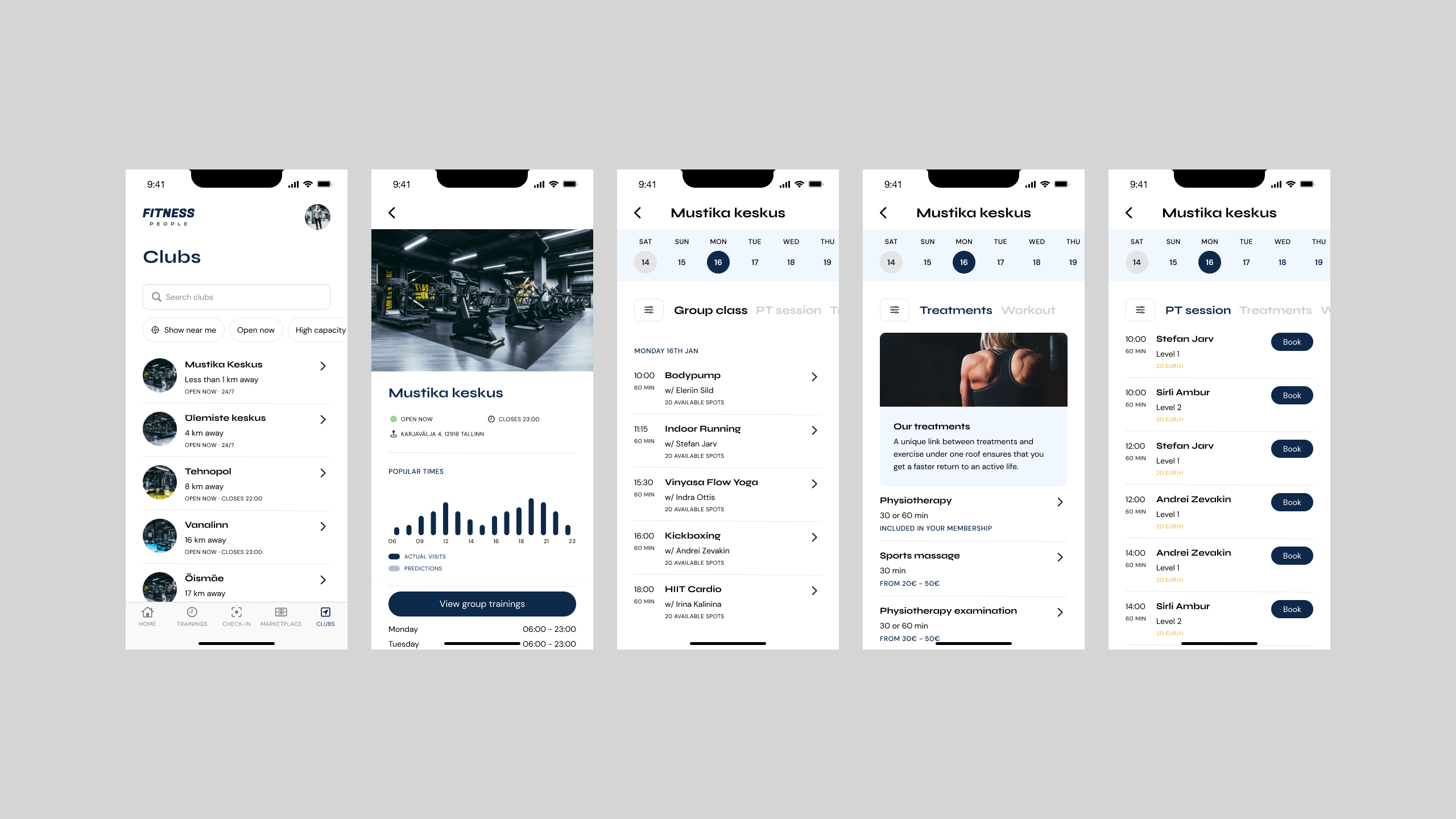
The main features of the app were modernised, better structured and given a nicer and simpler approach. User could now search for clubs within his area and find out all the information about it such as trainings, coaches available and popular times when user can expect more people to be at the facility.
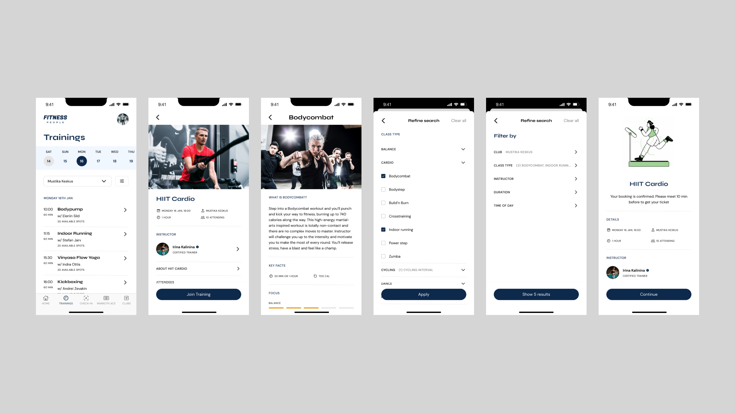
A new calendar and bookings system was also implemented having into account that it represented one of the most used and critical features of the app which is users being able to find out workouts or trainings and be able to book them. On this updated version of that feature users can apply different filtering options to refine their search as well as getting detailed information about the type of workout/training and in case of need contact the coach who carries out the selected event. It became easier as well for the user to keep track of his bookings as these are now saved on his calendar.
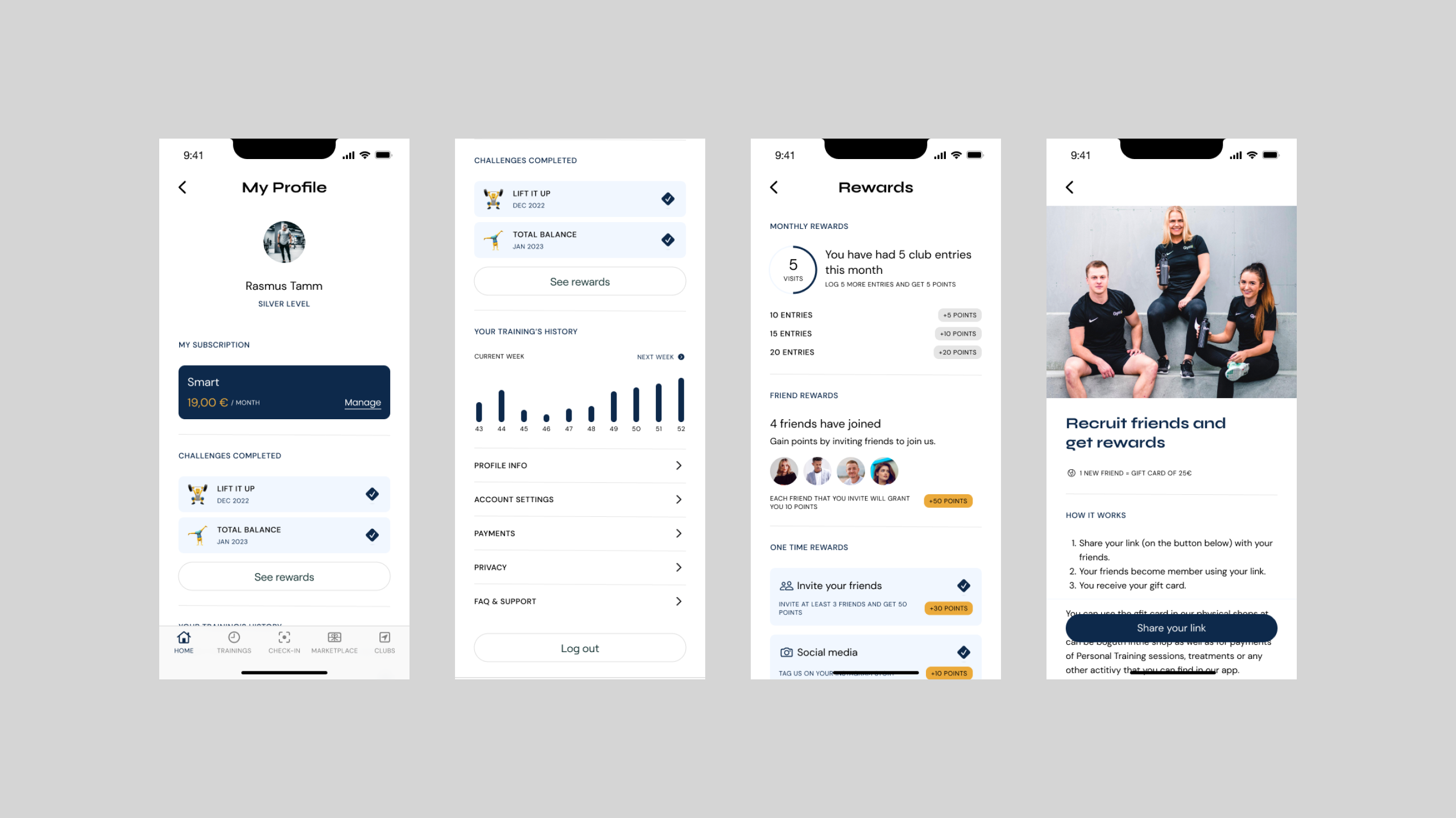
The Profile and rewards information also received a new look and more customised to the user approach, as the user should feel encouraged to make use of the app and get rewards that translate into "points" that he can later use for the Marketplace or to unlock special services or subscriptions.
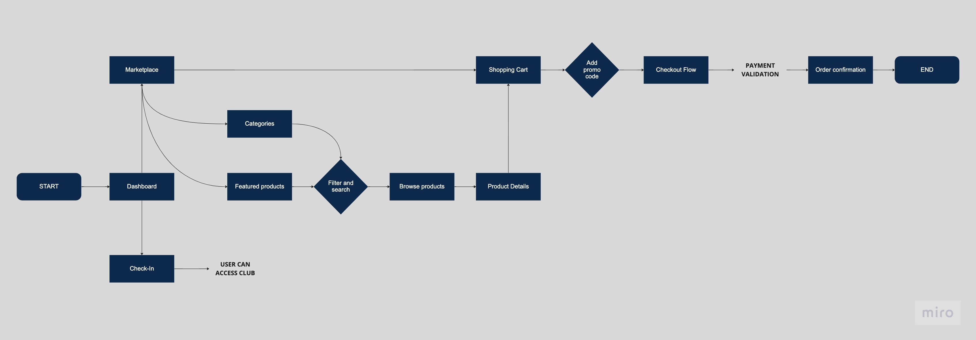
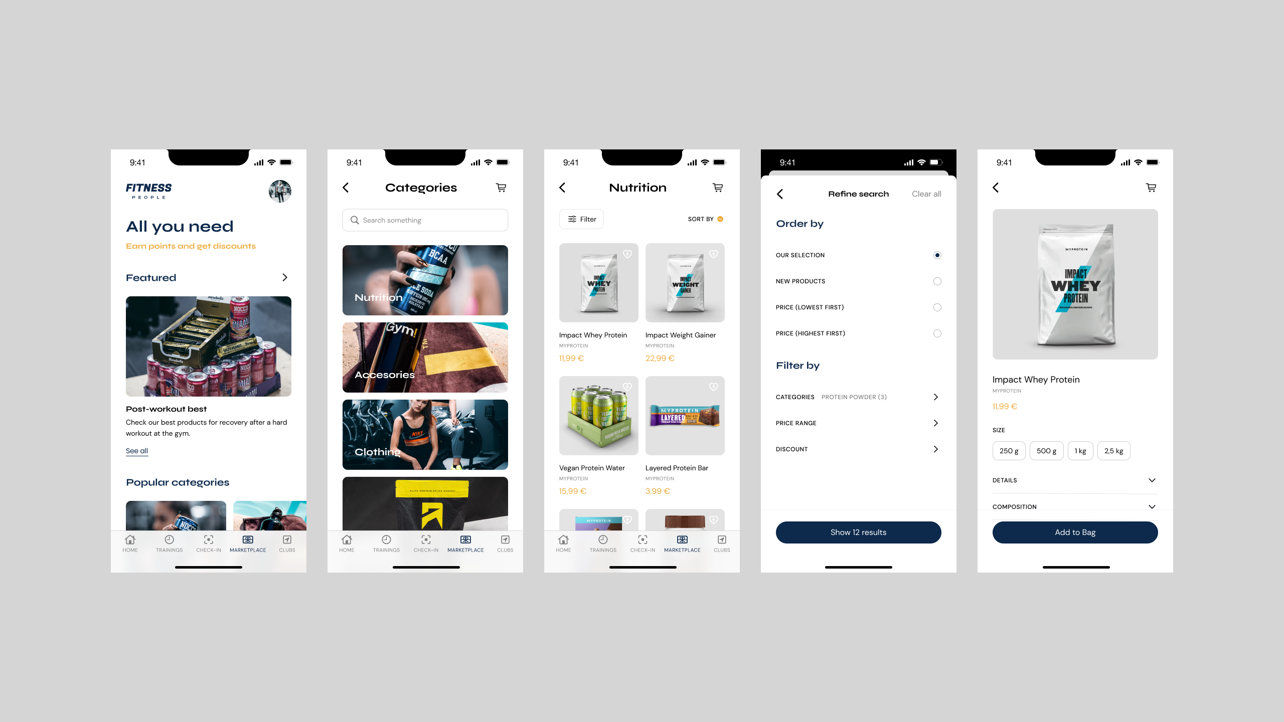
Probably the feature that needed the most a total restructuring was the Marketplace. The current solution was badly structured and the categorisation, search and browsing of products was confusing and rather messy. All of that was causing the users to not really interact with the Marketplace feature and the gym company was losing an important business side because of this.
The new approach for the Marketplace turned it into a more clean space were the exploration of products resonated more with what the common of users can find on typical stores and marketplace, that being taking into account filtering and sorting options as well as the checkout of products and the cart system.
Wabadus